Concept case study
Split & Settle
Designing a native group expense feature for OPay
Split & Settle is a concept for helping friends, roommates, and small groups track shared expenses, see who owes what, and settle balances inside OPay instead of juggling chats, calculators, and manual transfers.
Role
Product Designer
Project type
Concept / Product design assessment
Platform
Mobile
Scope
Product thinking, user flows, core interaction design, UI screens
The opportunity
As of 2025 OPay is one of Nigeria’s largest fintech platforms: a mobile wallet used for transfers, bill payments, cards, merchant payments, and everyday money movement at scale. The company says it serves 50M+ users and 1M+ merchants, which makes it the kind of product where a shared-expense feature could matter in real daily life, not just as a nice idea.
People already use payment apps to move money quickly, but shared expenses still tend to break outside the product. A group dinner, rent contribution, house bill, or weekend hangout usually becomes a messy mix of chat messages, rough calculations, and delayed transfers.
That gap matters. The payment happens in the wallet, but the coordination happens elsewhere.
For OPay, that creates a product opportunity: bring expense tracking, split logic, reminders, and settlement into the same environment users already trust to hold and move money. Instead of treating bill splitting as an external habit, Split & Settle turns it into a native part of the wallet experience.
The problem
Splitting expenses sounds simple until real life makes it messy.
Tracking breaks down
People forget who paid, who still owes, and which expense the money was for.
Fair splits take effort
Shared costs are not always equal, especially when people contribute differently.
Reminders feel personal
Following up for money can quickly become awkward in friend groups and shared households.
Paying is separate from planning
The split is often discussed in chat, calculated elsewhere, and settled manually later.
The goal
Design a simple in-wallet experience that helps users create a group, add a shared expense, split it equally or by custom share, track balances clearly, settle instantly through OPay, and send reminders without leaving the flow.
The solution
I designed Split & Settle as a lightweight group expense layer inside OPay. Instead of forcing users to manage shared costs across multiple tools, the feature keeps the full loop in one place: create a group, log an expense, assign shares, track balances, and settle with a tap.
The concept focused on four product decisions:
Make group setup quick enough for casual use
Reduce admin overhead so users can start a one-off hangout group or a recurring household group without friction.
Support both equal and uneven split logic
Keep the common case fast, while still handling real shared-expense scenarios where contributions differ.
Turn balances into a clear action state
Show what is owed, what is pending, and what the user can do next instead of burying that in history.
Reduce collection friction with reminders and native payment
Let users move from coordination to collection inside the same trusted wallet environment.
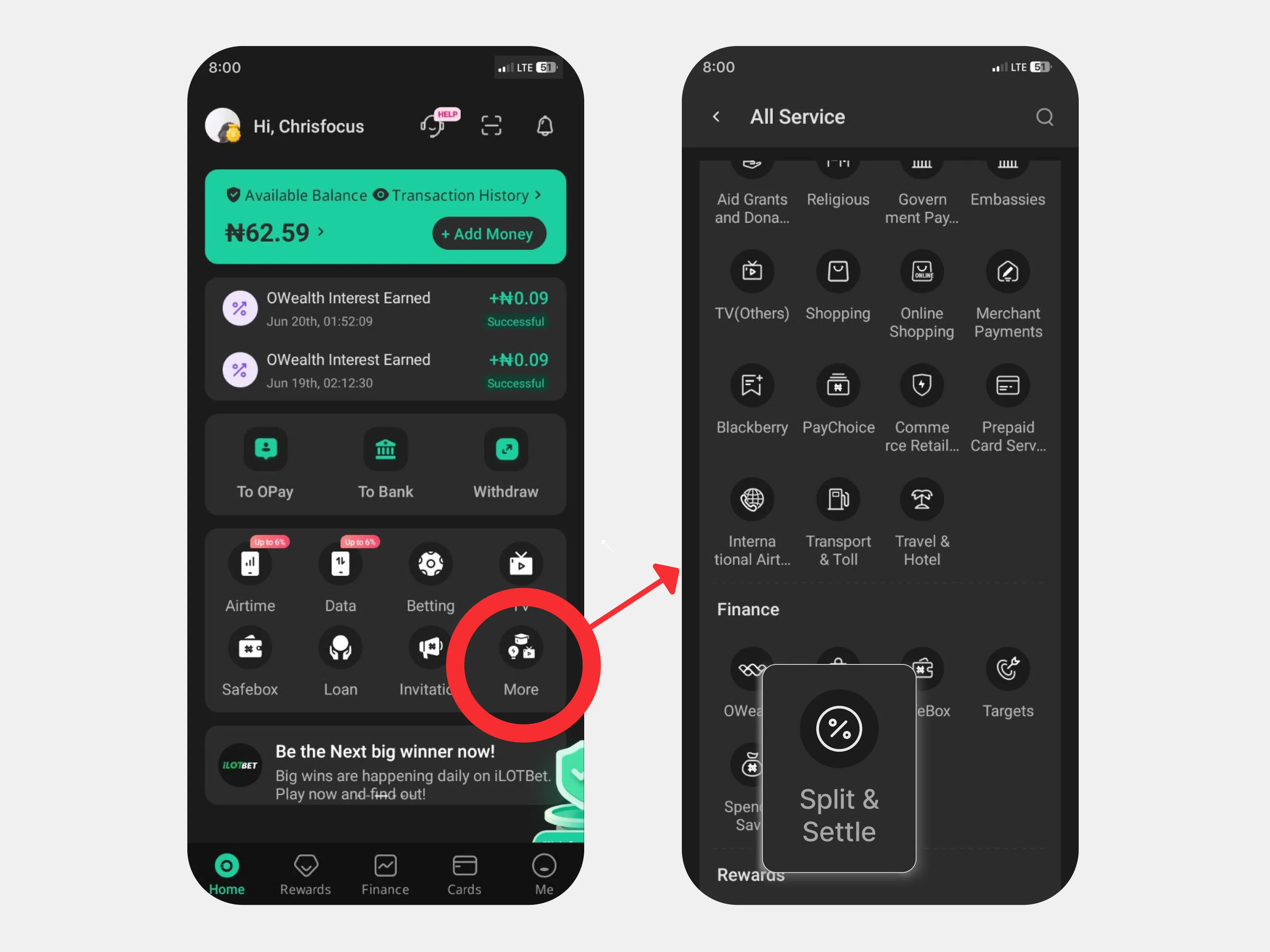
Start from the wallet people already use
A bill-splitting feature only becomes convenient if it lives where the money already is. Putting Split & Settle inside OPay removes one of the biggest hidden costs in shared expenses: switching between coordination and payment.
The feature begins inside OPay’s existing interface, making it feel like an extension of the product rather than a detached mini-app. That matters for trust and adoption. Users do not need to learn a new service just to manage a dinner bill or rent contribution.
Design for first-time use
The first version of a group expense feature has to do one thing well before anything else: make the product feel understandable from the first screen.
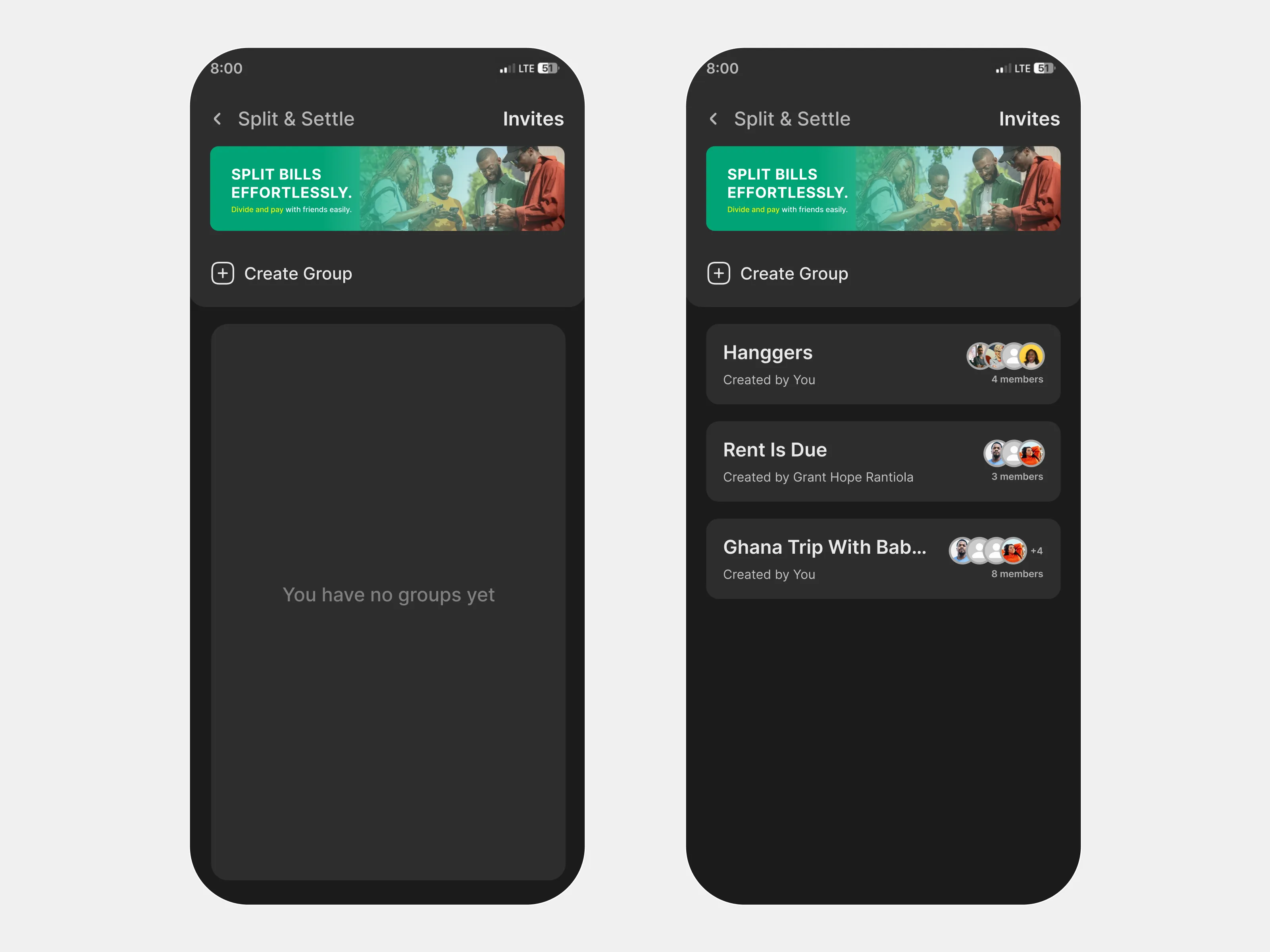
I kept the default dashboard lightweight, with a clear empty state and an obvious path to creating a group. The goal was to make the feature feel approachable before any setup had happened.
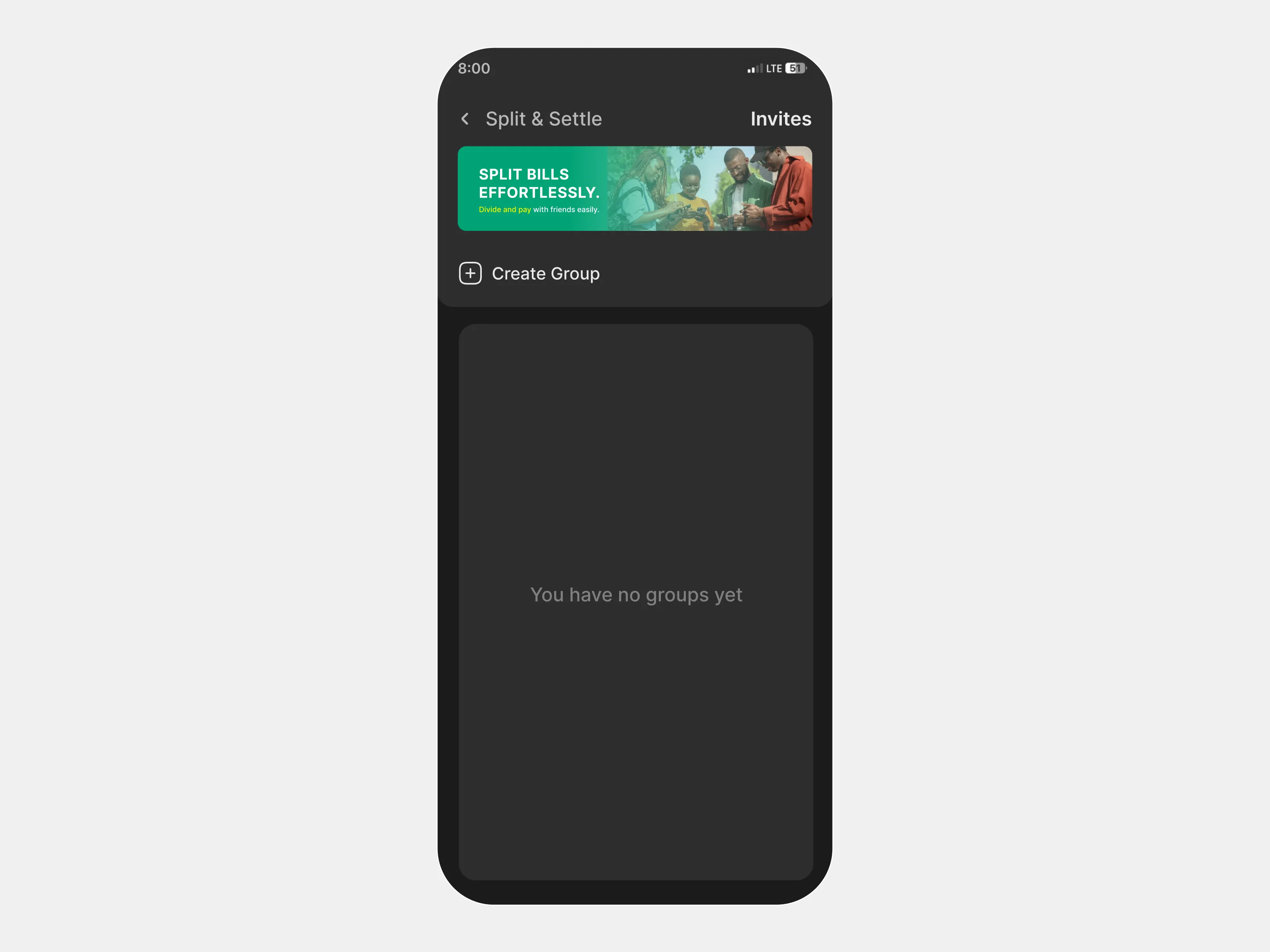
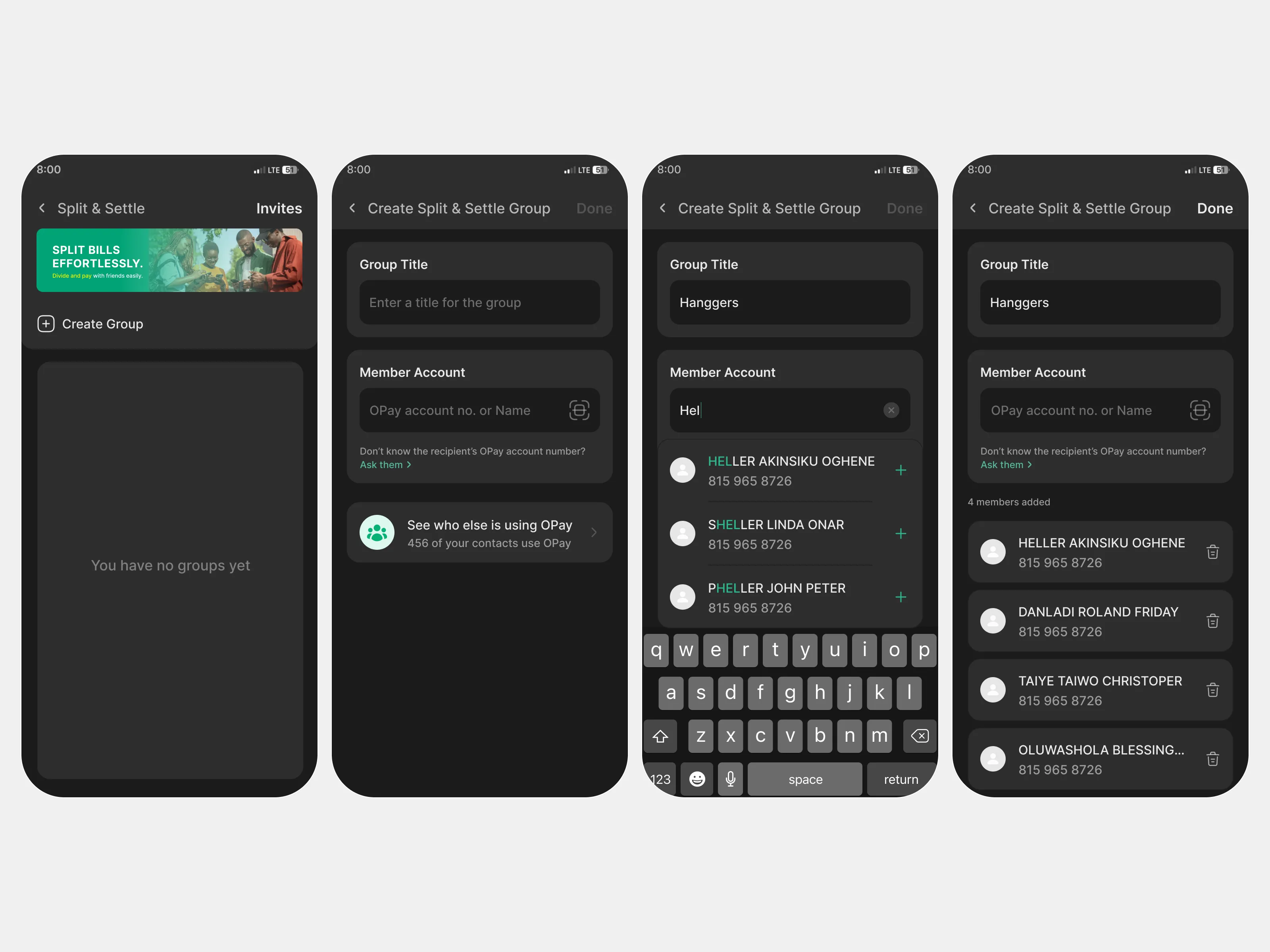
Make group setup quick enough for casual use
Group expense tools often become too heavy too early. If setup feels like admin work, people fall back to chat.
To reduce that friction, I kept group creation simple: create a group, name it, add members, and move directly into expense tracking. The intent was to make group creation feel fast enough for both one-off hangouts and recurring household expenses.
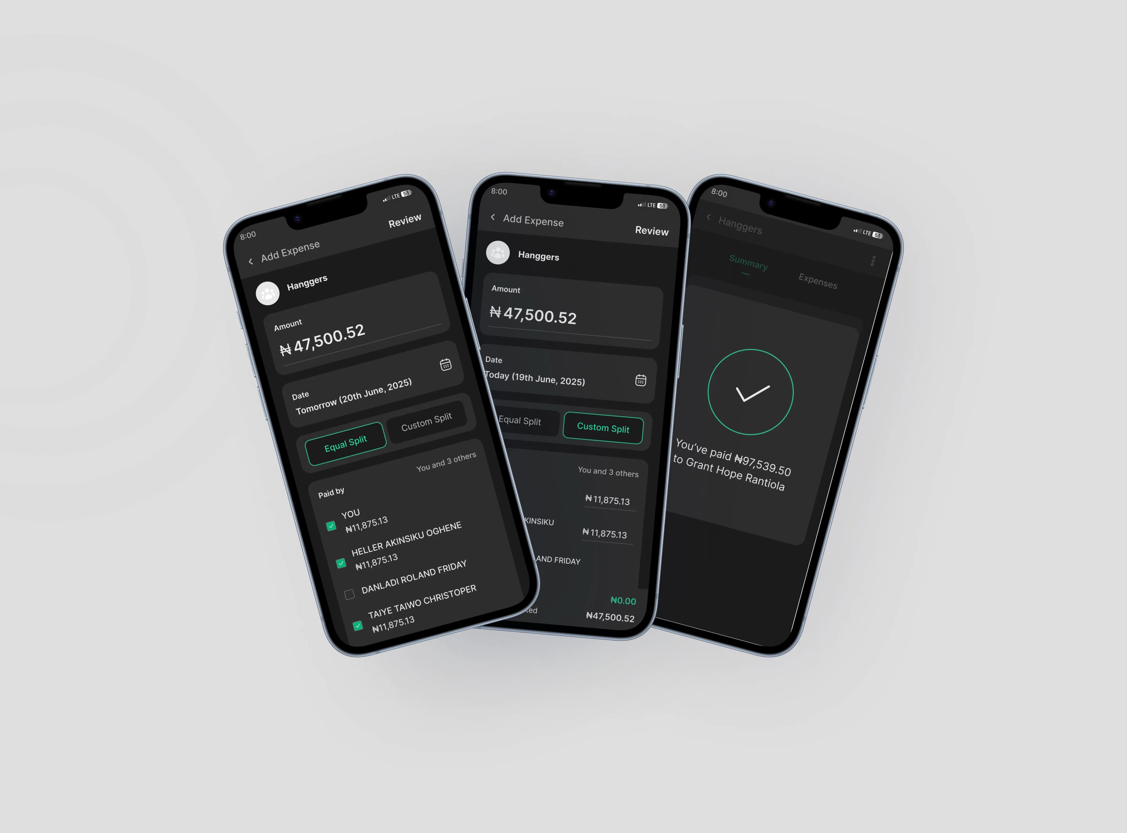
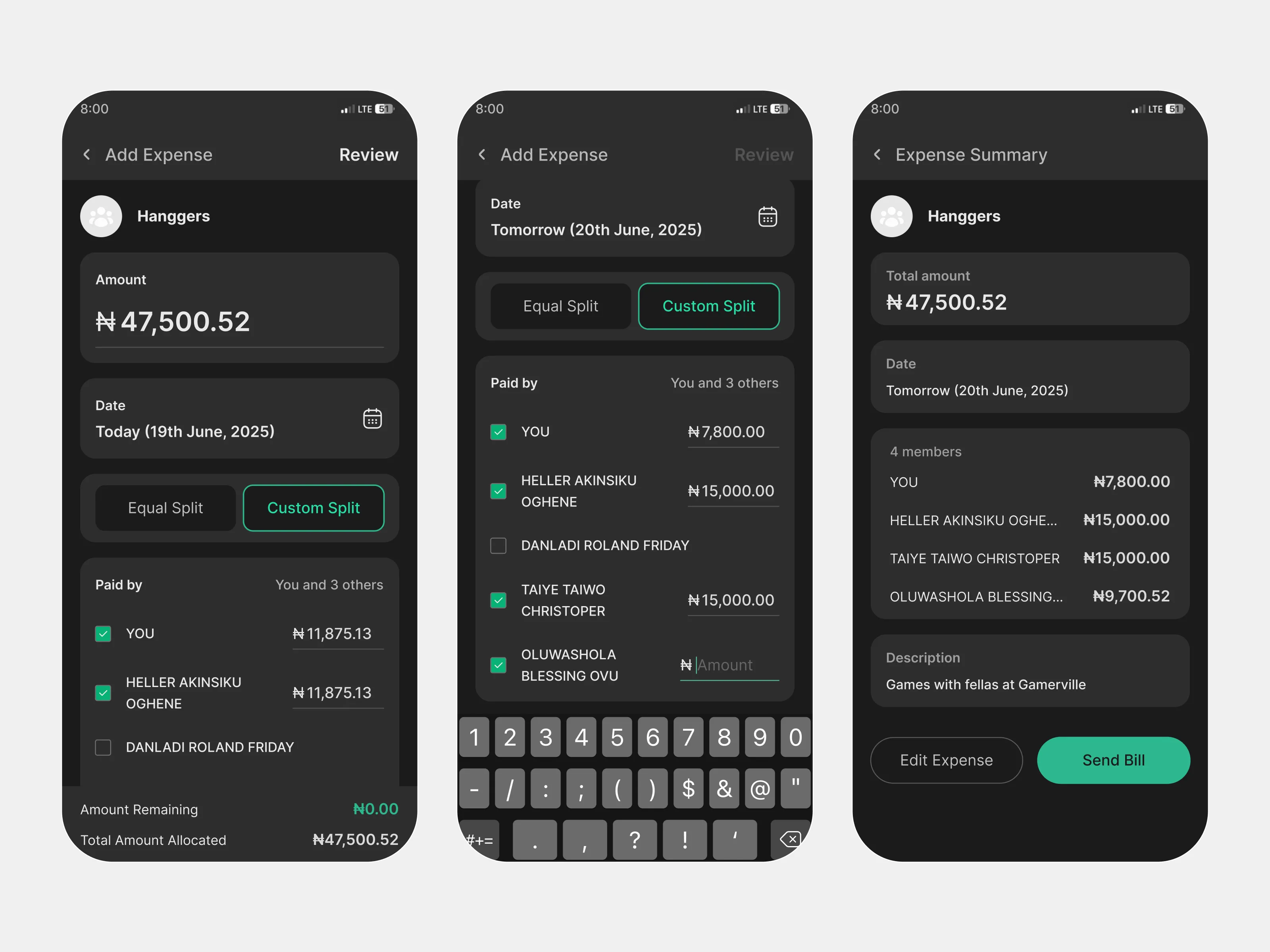
Make split creation flexible without making it confusing
Shared expenses are rarely all the same. Some costs should be divided equally. Others need custom allocations based on who participated, who paid upfront, or who consumed more.
To handle both cases, I designed the expense flow around two clear modes: equal split for speed, and custom split for real-world flexibility. This lets the common case stay simple without flattening every scenario into the same pattern.
Equal split
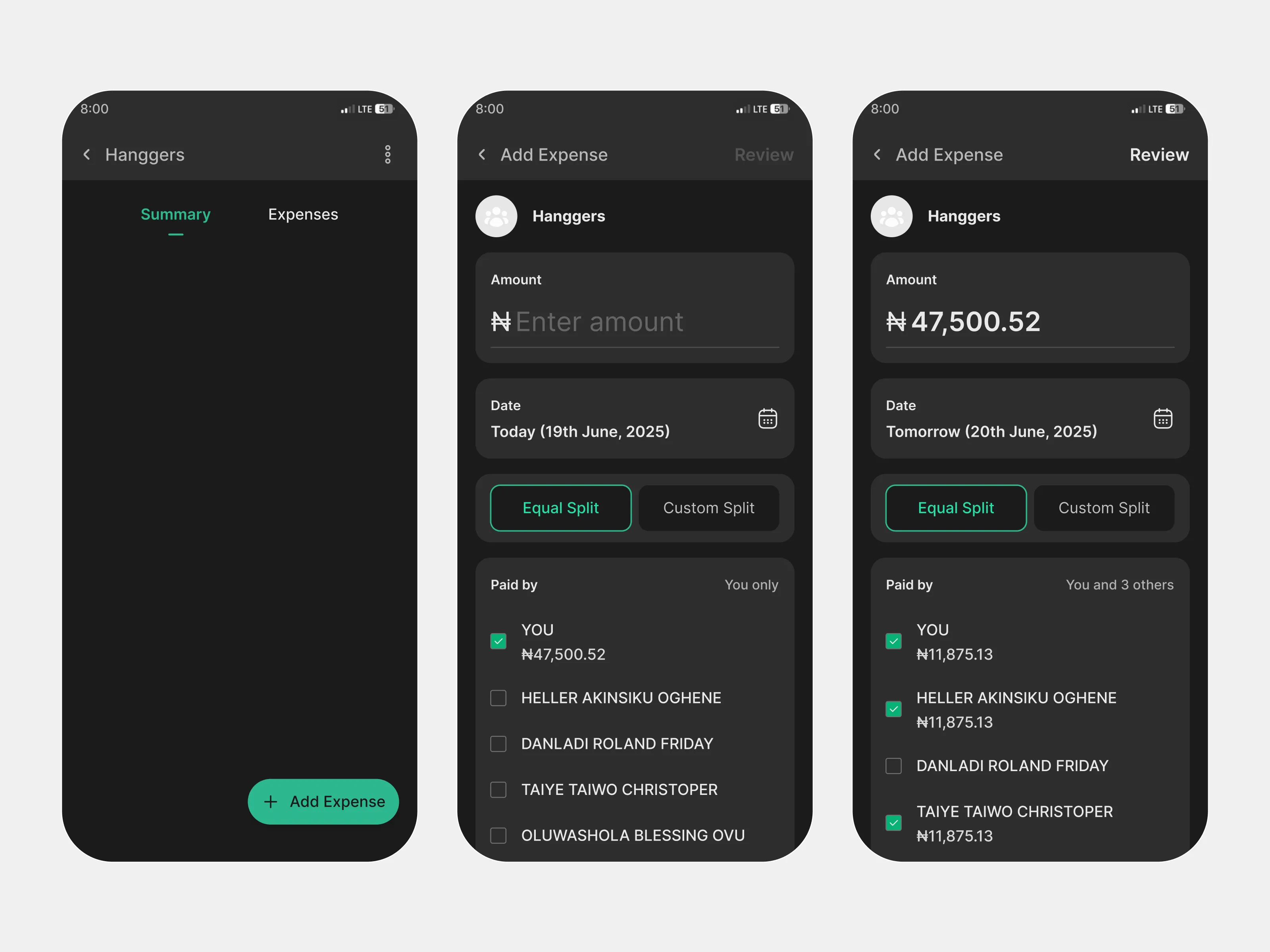
Custom split
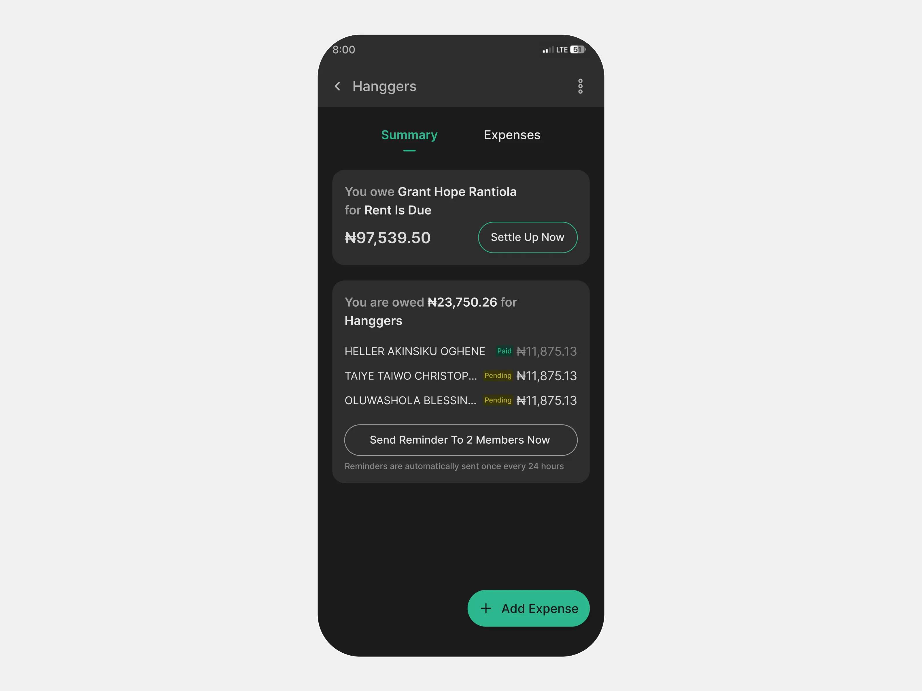
Turn balances into a clear action state
Once a bill is created, the most important question becomes simple: what happens next?
I designed the live balance view to answer that clearly. Instead of burying people in transaction history, the interface shows what I owe, what I am owed, who has paid, who is still pending, and what action is available now.
Keep the transition from setup to live expense tracking clear
The split flow should not feel complete the moment an expense is entered. Users still need to review, send, and understand that the expense is now active.
I used summary and confirmation states to make that transition explicit, so users can move from creating a split to managing a real shared balance without losing context.
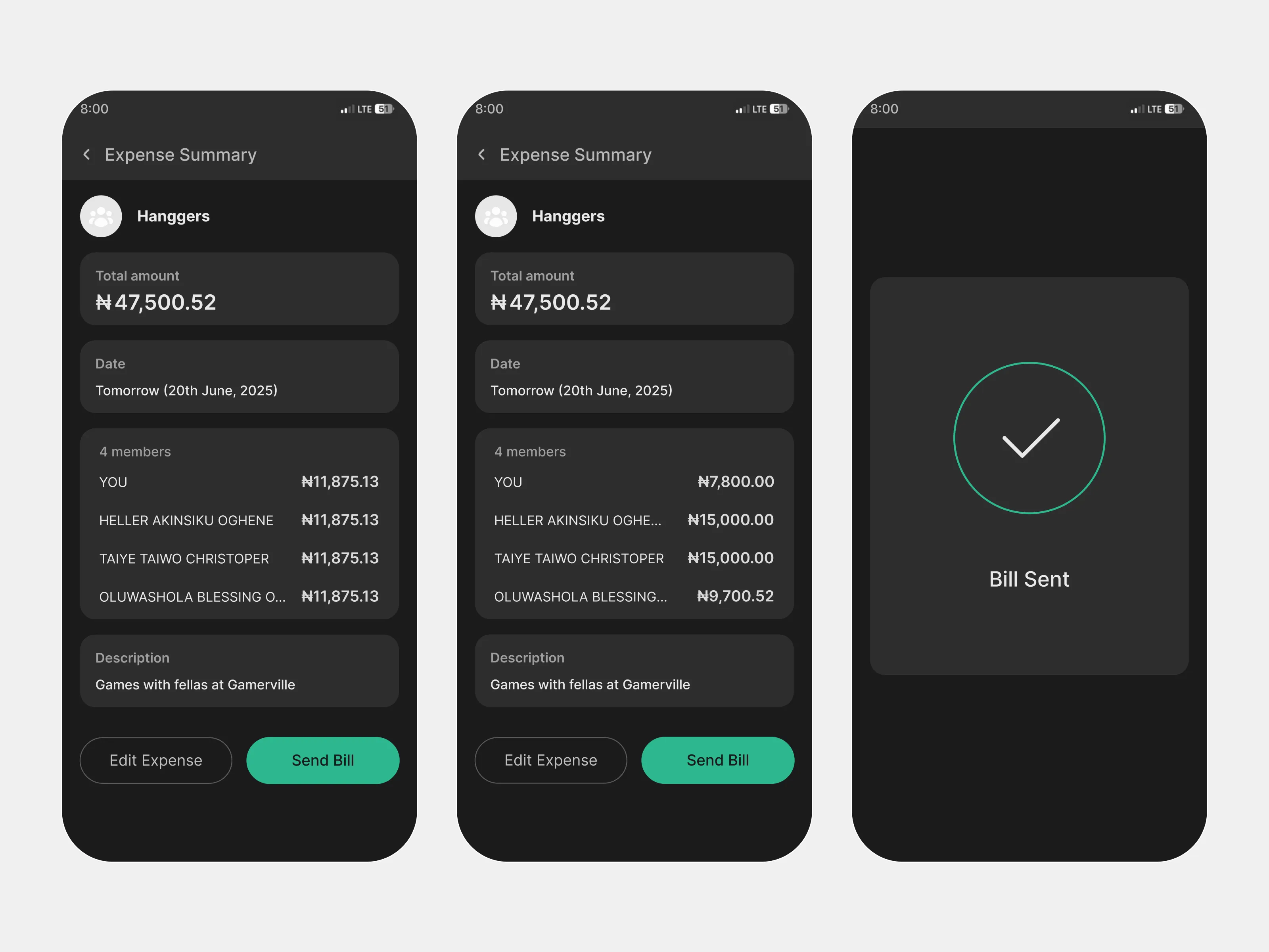
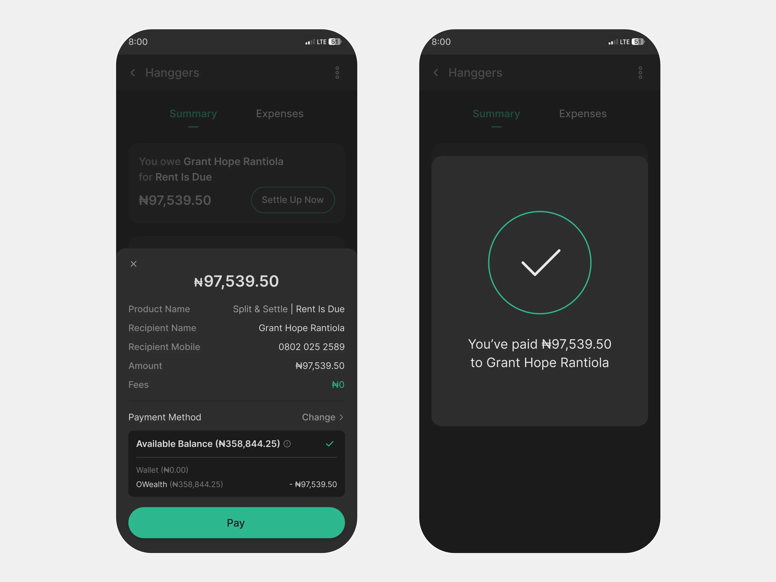
Make settlement immediate
The concept works best when the final step is not a handoff to another tool.
Because Split & Settle is designed for OPay, settlement happens natively through the wallet rails. Once a user sees an outstanding balance, they can move directly into payment, confirm the amount, and complete the transaction without leaving the flow.
That keeps the product from stopping at coordination. It closes the loop.
Dashboard states
I also explored the product in two distinct dashboard conditions: a default state for first-time or inactive users, and an active state showing ongoing groups and shared expenses. This helped define how the feature should feel both before and after adoption.
Outcome
Although this was a concept project rather than a launched feature, the design points to a clear product value for OPay.
Split & Settle would help shift shared expenses from fragmented coordination to a single in-wallet flow. Instead of asking users to remember numbers, message people repeatedly, and then initiate a separate payment, the experience keeps the cycle connected: track, split, remind, settle.
From a product perspective, that creates value in three ways:
Solve a recurring everyday money problem
It addresses a familiar, repeated coordination issue rather than a rare edge case.
Increase return use beyond solo transfers
It gives users a reason to come back to the wallet for shared financial moments, not just one-to-one payments.
Strengthen OPay’s role in group-based money behavior
It expands the wallet from a transfer tool into a place where shared financial coordination can actually happen.
What I’d validate next
Because this was an assessment concept, the next step would be validation, not shipping everything at once.
These are the questions I would use to pressure-test the product before deciding what deserves a deeper investment.
01
Do users expect equal split first, or should custom split be more visible earlier in the flow?
02
What reminder language feels helpful without feeling confrontational?
03
Do users instantly understand “you owe” versus “you are owed,” especially across multiple group expenses?
04
Are users more likely to create persistent groups for recurring expenses, or use the feature casually for one-off events?
05
What signals help users feel comfortable tracking interpersonal debts inside a wallet product?
Reflection
This project reinforced a simple truth: designing for shared money is not just about payment mechanics. It is about fairness, clarity, and social tone.
The strongest part of the concept was not the split calculation itself. It was treating group expense management as a full product loop inside a wallet users already trust. That shift made the feature feel less like an add-on and more like a natural extension of how people already move money.