Case Study
HireCleaner
Designing a clearer booking experience for a residential cleaning service website.
Role
Product Designer
Platform
Responsive Web
Scope
Website UX redesign, service-page clarity, estimate flow design, responsive web handoff
Team
Client stakeholder, Product Designer
At a glance
The problem
The site needed to make trust, service understanding, and quote-starting feel simpler for busy homeowners who wanted to book quickly without confusion.
What I changed
I clarified the homepage structure, improved service-page readability, and designed a cleaner step-by-step estimate flow that moved users from property details to scheduling, payment, and outcome states.
Why it mattered
For a service business like this, the website is not just marketing. It is part of the sales funnel. Reducing hesitation at key moments helps turn interest into completed booking intent.
The challenge
HireCleaner needed a website that felt straightforward, trustworthy, and easy to act on. The core challenge was not simply making the site look modern. It was making the service easier to understand and the booking path easier to begin.
In service businesses, hesitation usually comes from a few practical questions. What exactly am I getting? Can I trust this company? How do I start? And how much effort will this take?
The website had to answer those questions quickly while keeping the experience clean, calm, and conversion-focused across desktop and mobile.
My scope
I designed the case-study-ready website experience across the key marketing and booking surfaces, focusing on the moments most likely to influence action.
What I owned
- Structuring the homepage to communicate value more clearly
- Improving service-page clarity for a standard cleaning offering
- Designing the multi-step estimate flow from input to confirmation states
- Creating a cleaner visual hierarchy across supporting content like “How It Works”
- Designing responsive mobile versions so the experience stayed clear and usable across desktop and mobile
- Preparing a modular, developer-friendly UI direction
Key constraints
- The experience had to stay simple and familiar for a broad residential audience
- Booking intent needed to feel lightweight, not like a long form burden
- The layout had to remain clean and mobile-friendly without relying on visual excess
- Trust, clarity, and conversion needed to work together rather than compete for attention
What I focused on
I treated HireCleaner as a practical conversion design problem. The question was not “how do we make this look more impressive?” It was “how do we make the service feel easier to understand and easier to start?”
That led me to focus on three things:
1. Clarity before persuasion
Before users compare options or feel convinced, they need to understand what the service is, what the process looks like, and where to begin.
2. Reduce friction in the quote path
Every step in the estimate flow needed to feel manageable and progressive rather than heavy or uncertain.
3. Build trust through structure
Clean hierarchy, predictable steps, and clear outcome states do more for trust than decorative complexity ever will.
Key decision 1 — Making the homepage easier to trust and scan
The homepage had to do a lot of work quickly. It needed to explain the offer, establish credibility, and give users a clear path into the booking journey without feeling crowded.
The problem
If the first screen asks users to work too hard to understand the service, confidence drops early. For a residential cleaning brand, that first impression needs to feel both polished and easy.
The design move
I structured the homepage to foreground the core value proposition, support scanning with cleaner section rhythm, and make the next action feel obvious without shouting for attention.
Why this mattered
A clearer homepage reduces early confusion and gives the rest of the site room to do its job. It becomes easier for visitors to understand the service and continue into the booking path with less hesitation.
Key decision 2 — Clarifying the service page and supporting content
Service businesses often lose momentum when service details feel vague or fragmented. Users should not need to decode what is included or how the process works.
Service-page clarity
The service page needed to make a standard cleaning offer feel easy to understand, credible, and worth acting on.
Supporting page
I paired the main service page with a cleaner “How It Works” support layer so users could understand the process without leaving the experience with more questions than they started with.
Why this mattered
Clarity at this stage helps bridge the gap between curiosity and action. When the service and process feel straightforward, users are more likely to move into the estimate flow confidently.
Supporting page —How It Works
Key decision 3 — Designing the estimate flow as a calm step-by-step journey
The estimate flow was where intent became action. That meant the experience had to feel progressive, low-friction, and dependable from the first input through the final state.
The problem
Multi-step forms can easily become a drop-off point when users are asked for too much too quickly or when the next step feels unclear.
The design move
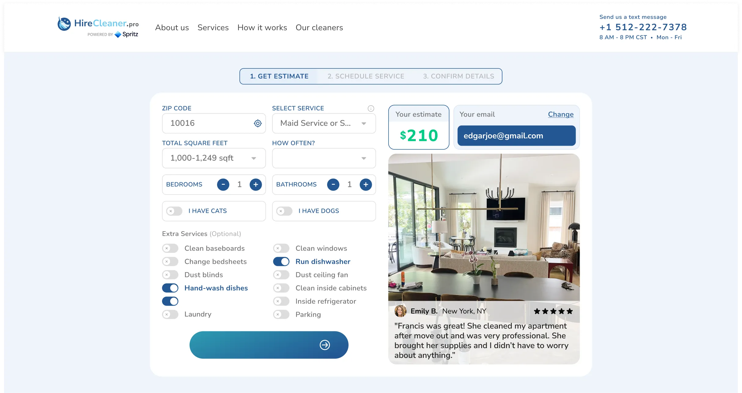
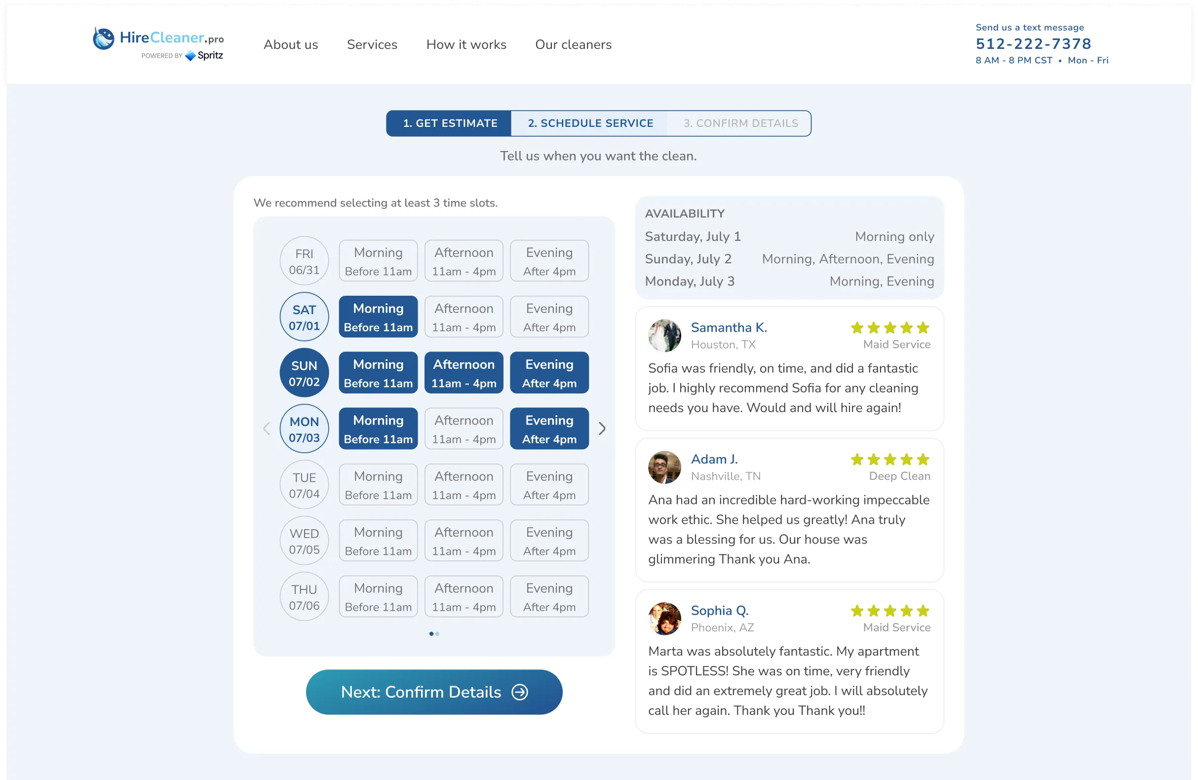
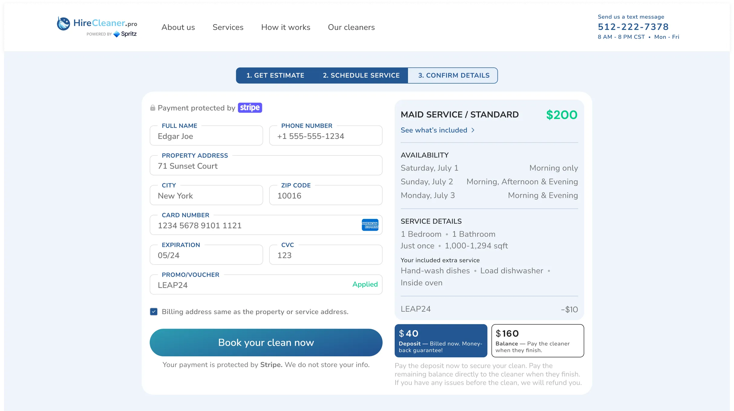
I broke the estimate experience into a clear sequence: property details, scheduling, confirmation and payment, then final outcome states. Each screen focused on one main job so the process felt guided rather than overwhelming.
Why this mattered
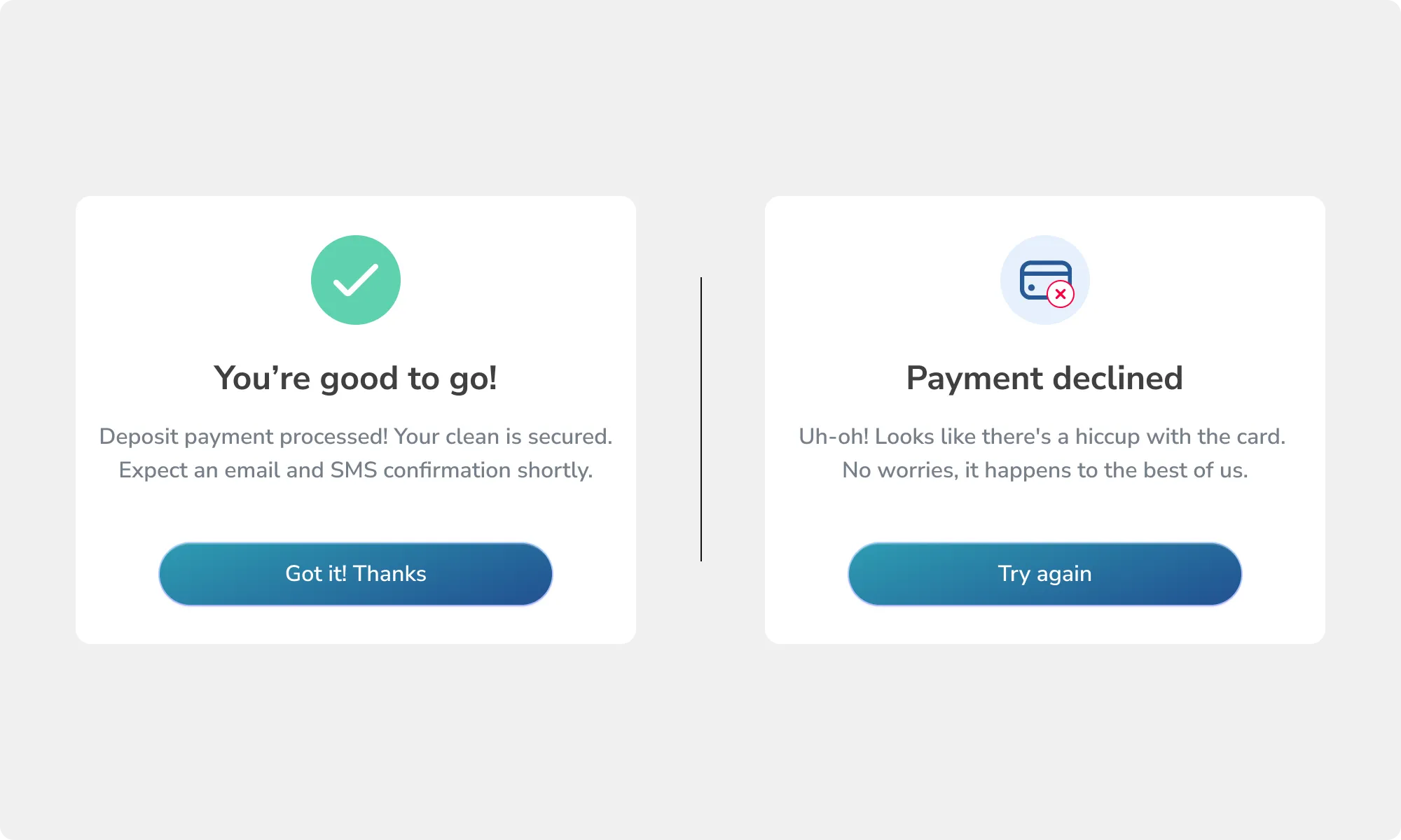
This turned the quote path into a more reassuring journey. Users could understand where they were, what was needed next, and what the result of the flow would be.
What improved
The step-by-step structure reduced cognitive load and made the experience feel more manageable on both desktop and mobile.
Just as important, the outcome states helped the flow feel complete. Good booking experiences do not stop at data entry. They also confirm progress clearly.
Step 1 — Property details
Step 2 — Schedule selection
Step 3 — Confirmation and payment
Step 4 — Outcome states
Handoff and delivery
The final work covered the homepage, service clarity, supporting process content, and the full estimate journey. I kept the layout modular so the experience could scale without turning into a one-off design exercise.
I also designed responsive mobile versions of the web experience so the structure, hierarchy, and booking flow stayed clear across breakpoints.
Instead of relying on screenshot-based metrics, I framed the delivery in simple product terms: clearer entry points, cleaner decision moments, and a quote flow structured to support completion.
1
Homepage direction
5
Core service pages
4
Estimate flow stages
Outcomes
Clearer first impression
The homepage direction made the brand feel more trustworthy and easier to understand from the first screen.
Better service comprehension
The service and process pages reduced uncertainty by explaining both the offer and the journey more cleanly.
Lower-friction booking path
The estimate flow broke a potentially heavy task into smaller, more manageable steps that better support completion.
Reflection
Clarity is part of conversion
For service websites, users do not need more drama. They need to understand what they are buying and how to begin.
Trust is built through structure
A calm hierarchy, clear steps, and clean confirmation states can do more heavy lifting than decorative polish.
Simple flows usually win
The strongest work here came from reducing uncertainty and keeping each screen focused on one job at a time.