Case Study
Spritz
Redesigning critical field workflows in a mobile-first service app.
- Role
- Product Designer
- Platform
- Mobile
- Scope
- Beta iteration, workflow redesign, design system extension, developer handoff
- Team
- Product Manager, Engineers, Data Analyst

At a glance
The problem
Technicians were hitting friction in key mobile workflows, especially around job-state updates, route visibility, invoicing, and schedule changes.
What I changed
I redesigned the home workflow, introduced map-based job context, and brought invoicing, payments, and scheduling actions closer to where work actually happened.
Why it mattered
The mobile app needed to support real field conditions, not just mirror desktop logic. The redesign made core tasks easier to complete while working between jobs, on-site, and under time pressure.
The challenge
Spritz’s beta version already covered the basics of job management, but it was still asking field technicians to work too hard to complete simple tasks. The product supported the workflow in theory, but not always in the messy reality of live service work.
From analytics, team feedback, and user research, four problem areas stood out.
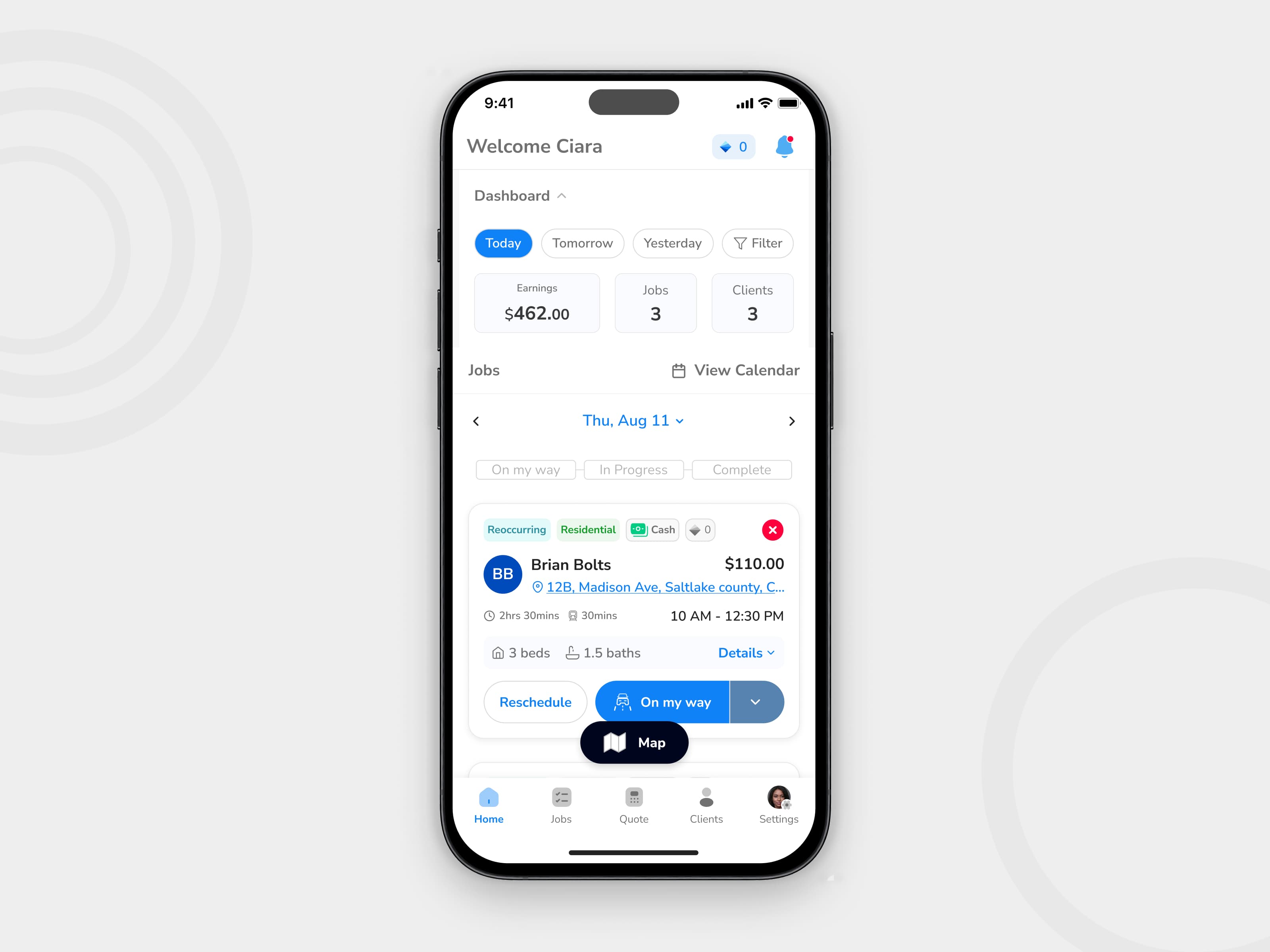
1. Job-state updates were unclear
Technicians needed to move jobs through key states quickly, but the action model was not obvious enough during fast-moving field work. Important next steps could be missed or delayed.
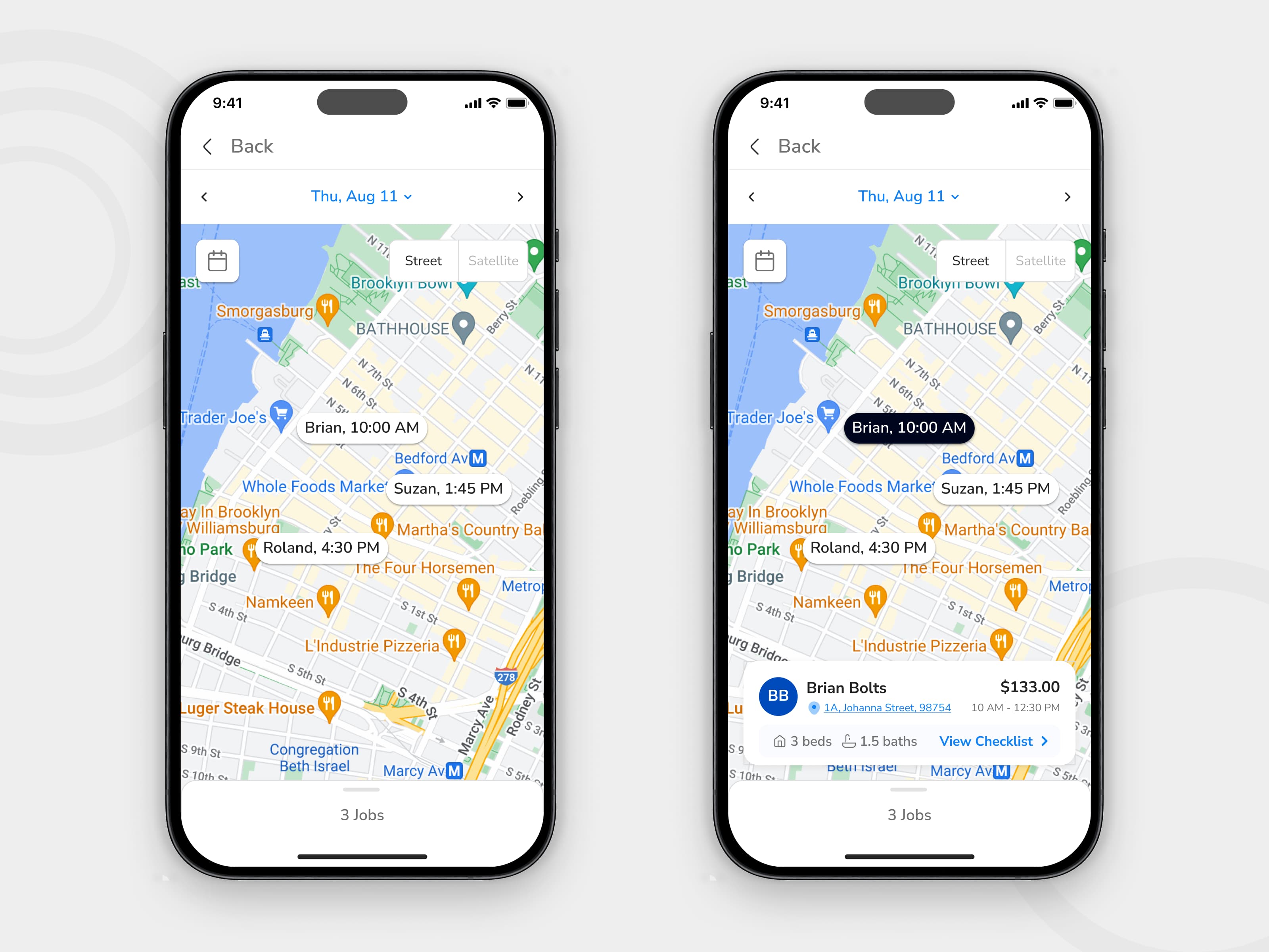
2. There was not enough spatial context
Users could see their jobs, but they could not easily understand them in relation to time, distance, and route. That made planning the workday harder than it needed to be.
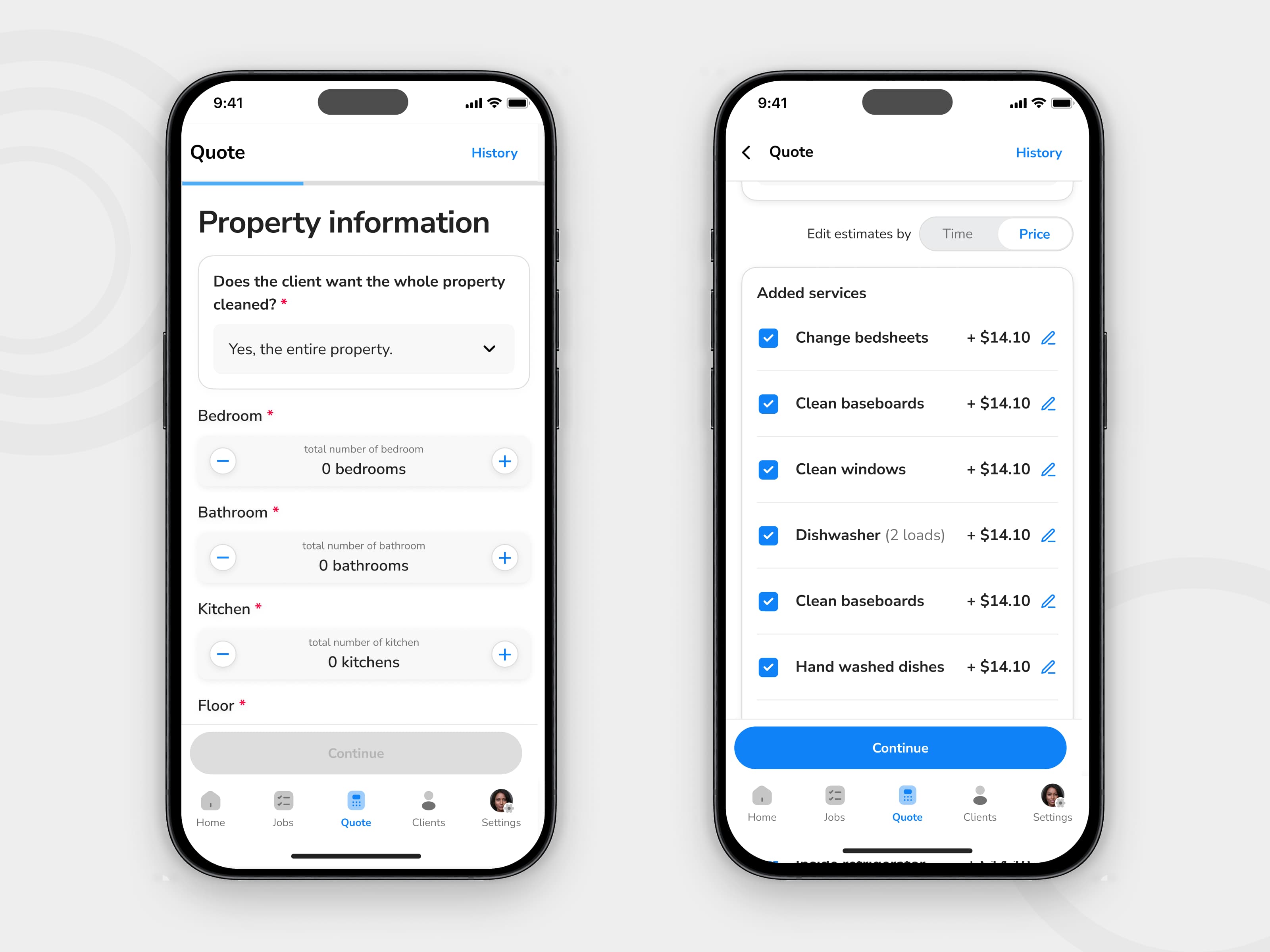
3. Invoicing and payment actions happened too late
Payment-related tasks were not well integrated into the mobile workflow, which created unnecessary delay between completing work and collecting payment.
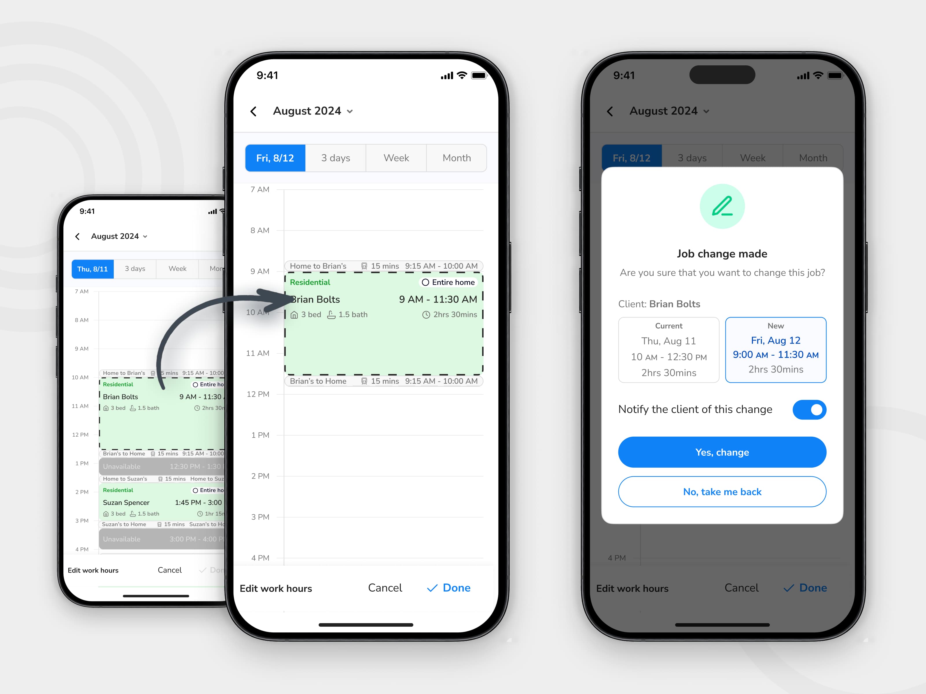
4. Scheduling changes created extra friction
Rescheduling, cancellation, and calendar-related actions needed to be more robust. These were common operational tasks, but the mobile experience did not yet support them cleanly enough.
My scope
I owned the end-to-end design of the mobile workflow improvements across research synthesis, interaction design, prototyping, design system extension, and handoff.
What I owned
- Synthesizing analytics and user feedback into product opportunities
- Redesigning key mobile flows across status updates, navigation context, invoicing, payments, and scheduling
- Exploring and testing interaction options for critical actions
- Extending existing mobile patterns within the current design system
- Preparing production-ready handoff for engineering
Key constraints
- The product already existed, so this was not a blank-slate redesign
- The mobile experience had to work within an existing React Native product structure
- The redesign had to align with current backend logic and live workflow dependencies
- Field conditions mattered: time pressure, context switching, and unreliable connectivity had to be considered
What I learned
Rather than treating this as a visual refresh, I approached it as a workflow problem. The real question was not “how do we improve the interface?” It was “where is the app failing people during live work?”
From usage patterns
The strongest signals pointed to friction in repeated operational tasks: moving jobs through states, viewing nearby work, collecting payment, and changing schedules without breaking the flow of the day.
From user feedback
Technicians needed faster decision-making in the moment. They were not sitting down to manage jobs carefully. They were switching context between driving, arriving, working, updating, and moving to the next stop.
From product and business needs
The mobile app had to do more than display job information. It had to support the operational realities that affect completion, payment, and service continuity.
Design approach
I focused the redesign around three practical principles:
1. Reduce decision friction
Core actions needed to be easier to understand and harder to miss.
2. Bring context closer to action
Users should not have to jump between disconnected views to understand where they were, what was next, or what needed attention.
3. Support completion in the field
Important tasks like payment collection and schedule handling needed to happen closer to the moment of work, not as delayed admin.
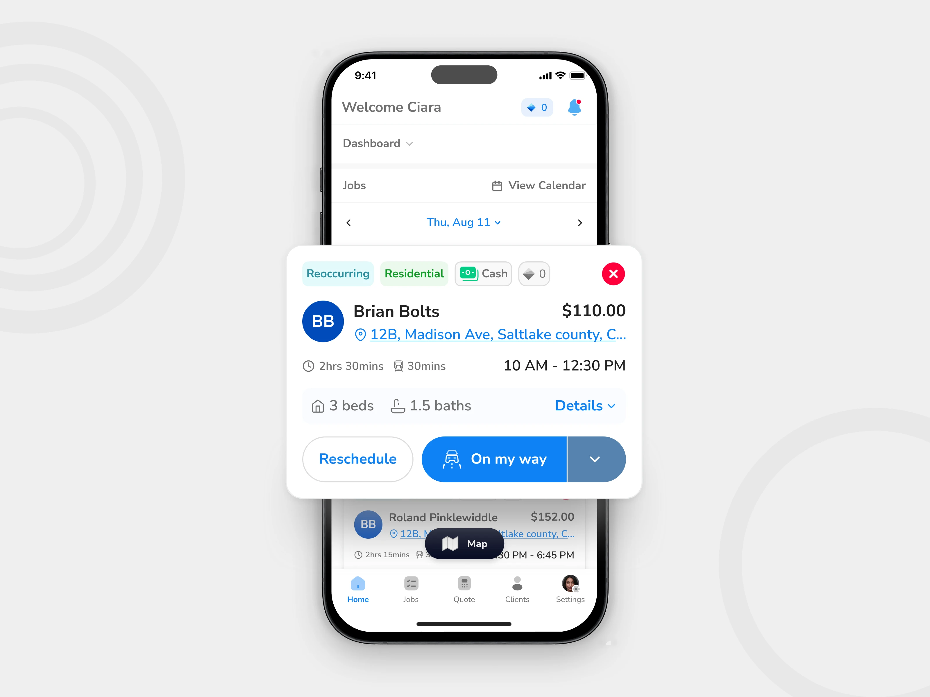
Key decision 1 — Simplifying job-state progression
One of the most important interactions in Spritz was moving a job through its next state. This sounds small, but it sits at the center of the technician workflow. If status updates are unclear, the rest of the system starts to break down around them.
The problem
The beta experience did not make the next best action obvious enough. In field conditions, that created unnecessary hesitation and increased the chance of missed updates.
What I explored
I tested different ways of presenting next-step actions, including more explicit multi-step actions and more compressed variants. The challenge was balancing clarity with speed. Too much guidance made the interface heavier. Too little made it easier to miss the right action.
Final decision
I landed on a clearer multi-action CTA model that better matched the actual progression of work while keeping the home screen usable at a glance.
Why this mattered
This made the next step more visible without turning the interface into a dense task controller.
This was not just a button redesign. It was a workflow decision. The status model needed to help technicians move confidently from one stage of work to the next, especially during quick transitions.
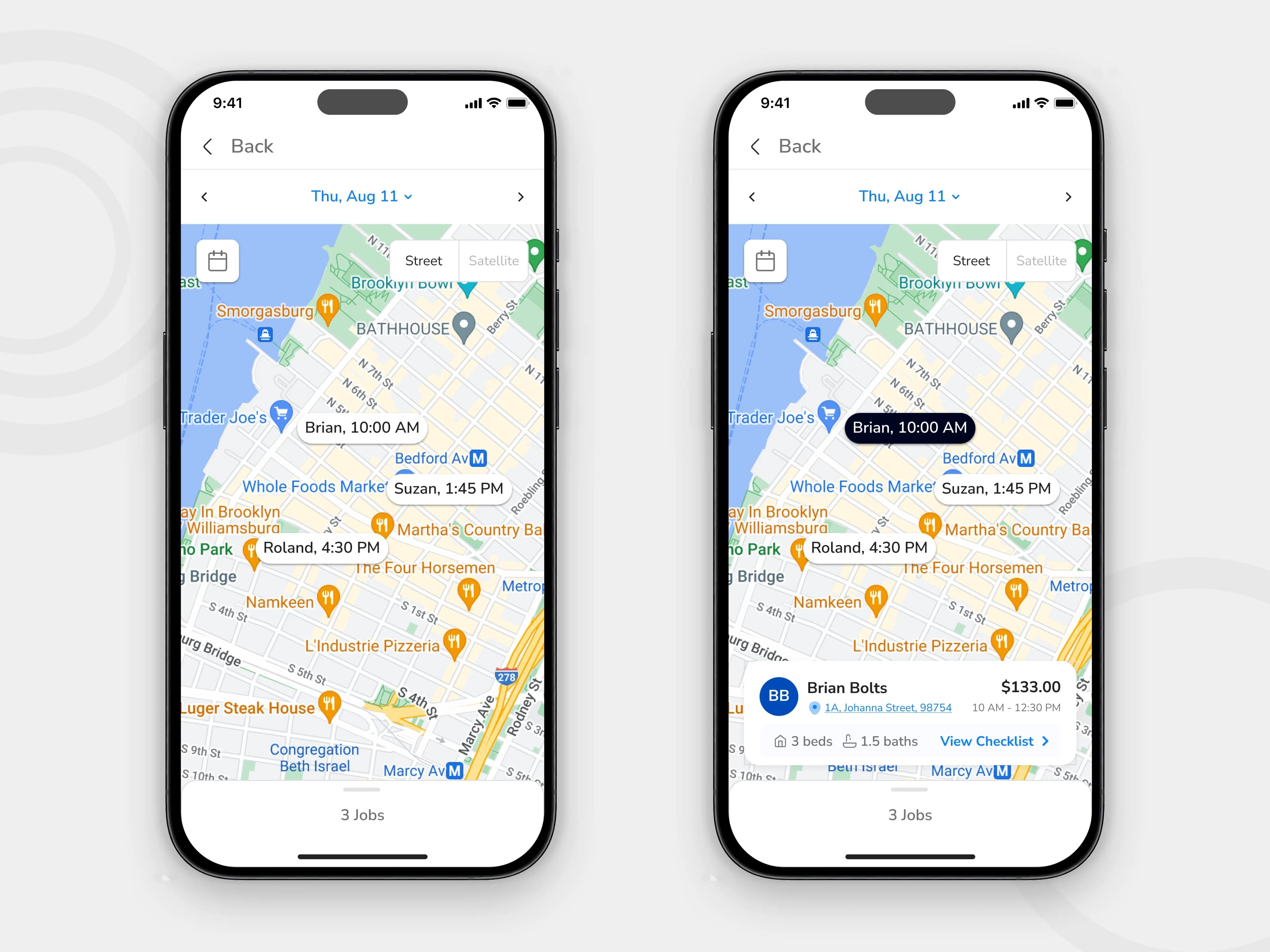
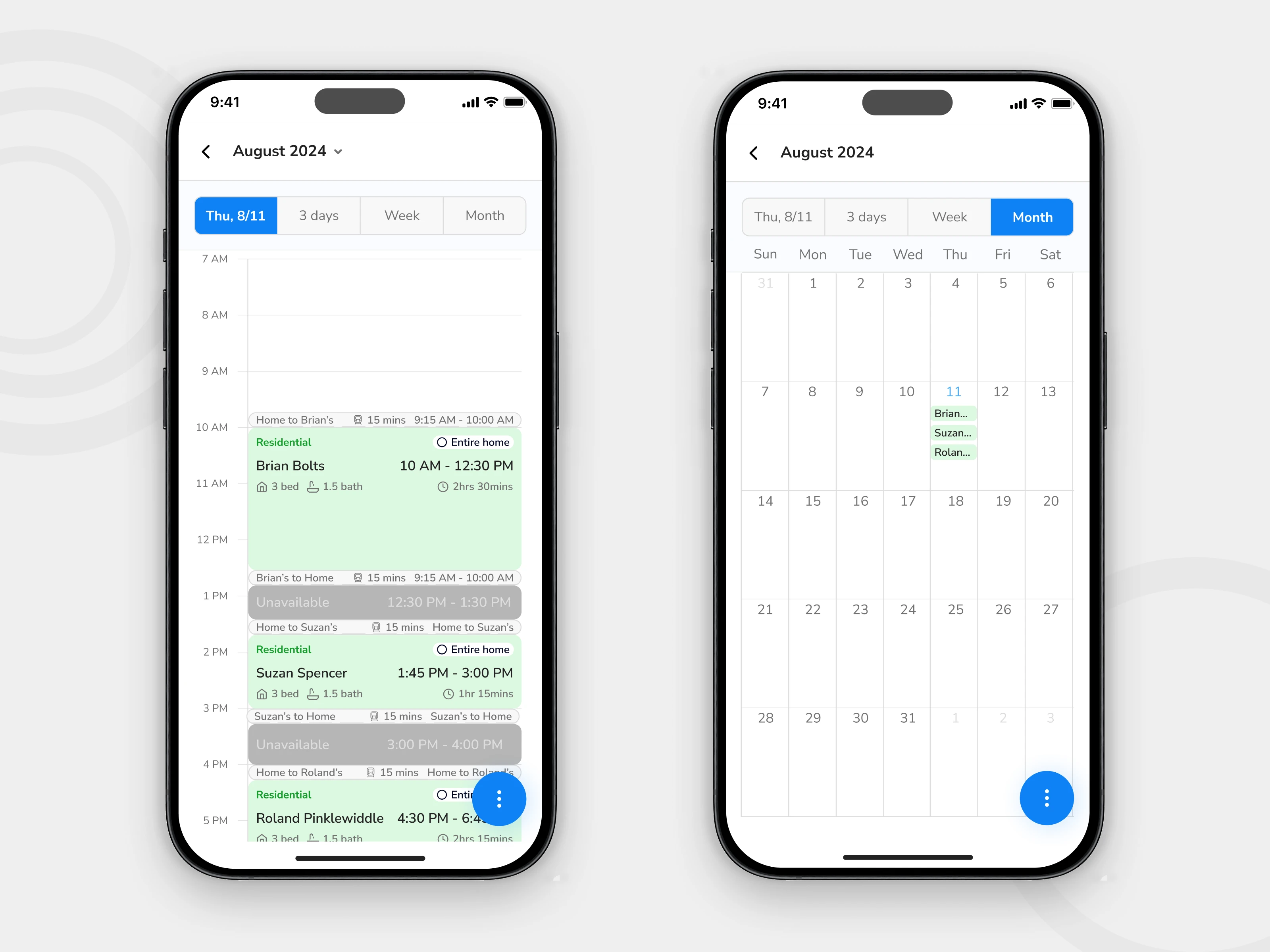
Key decision 2 — Adding map-based job context
Field technicians do not experience work as a list alone. Their day is shaped by location, distance, sequence, and movement. The mobile experience needed to reflect that.
The problem
The beta version surfaced job information, but it did not provide enough location-based context to support quick planning between jobs.
The design move
I introduced map-based job visibility as a more useful planning layer for mobile users. This gave technicians a clearer sense of where jobs were, how work was distributed, and what to handle next.
Why this mattered
The map view helped shift the product from passive job display to active field support. It made the app more useful during movement, not just during review.
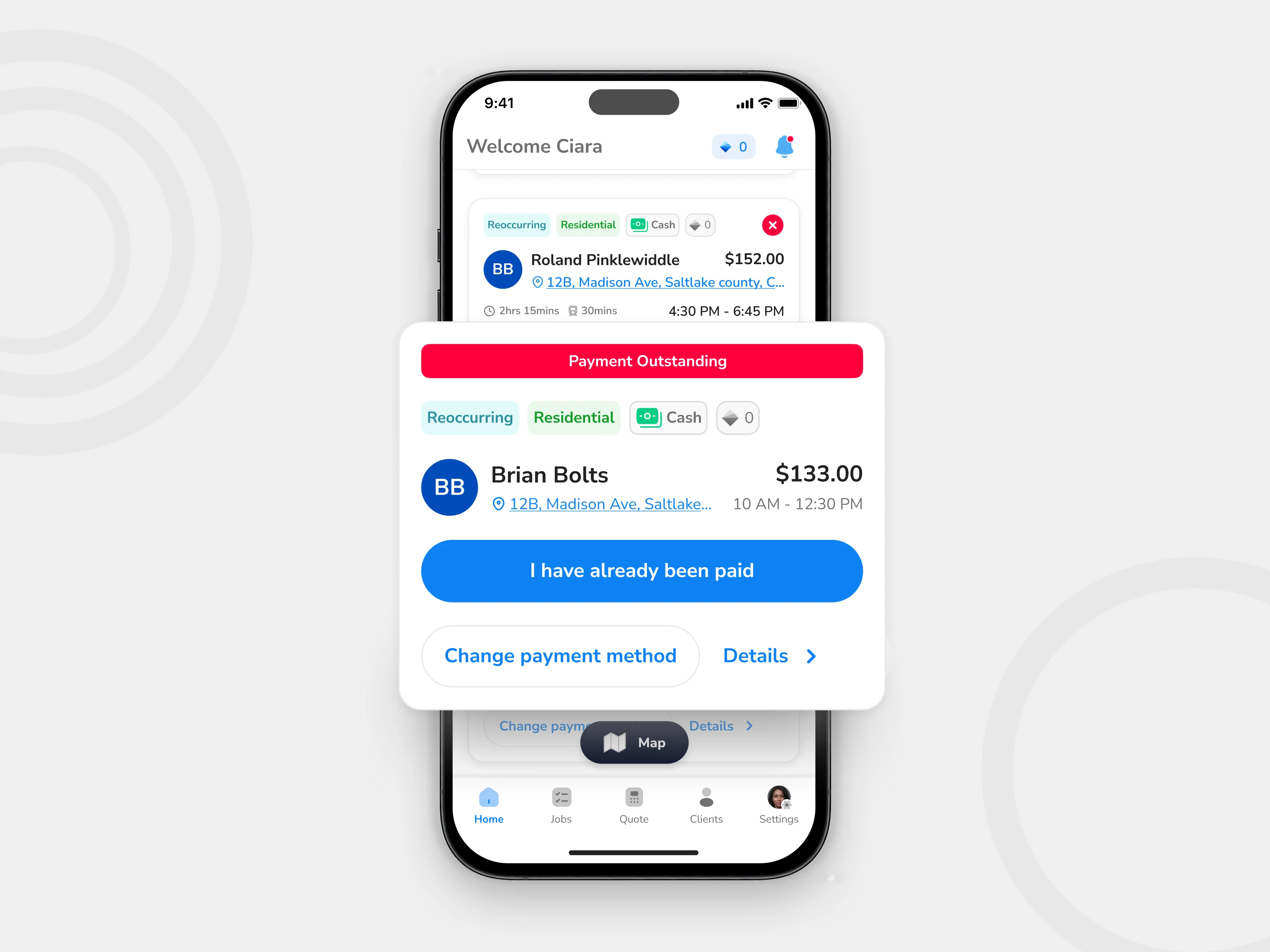
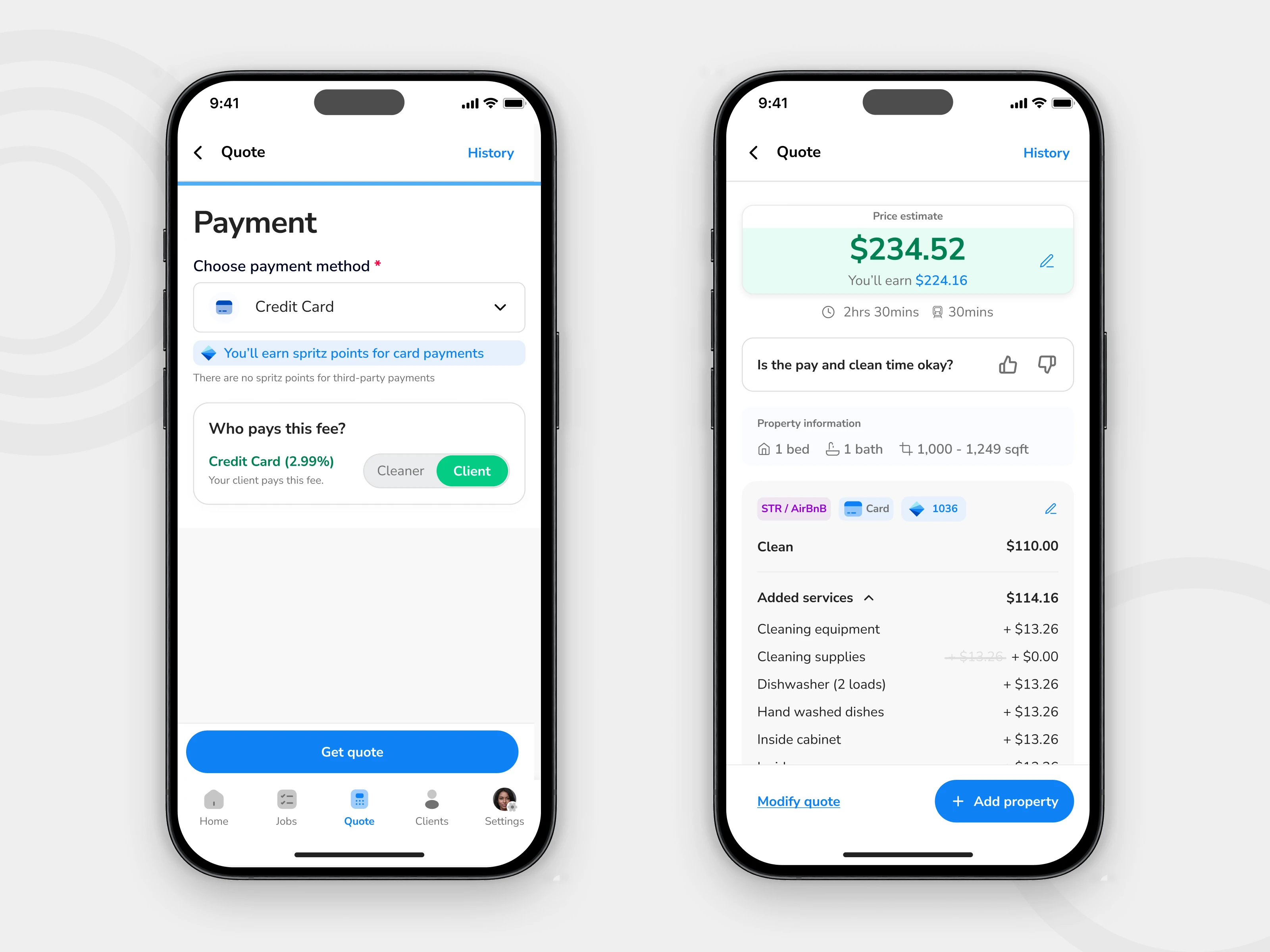
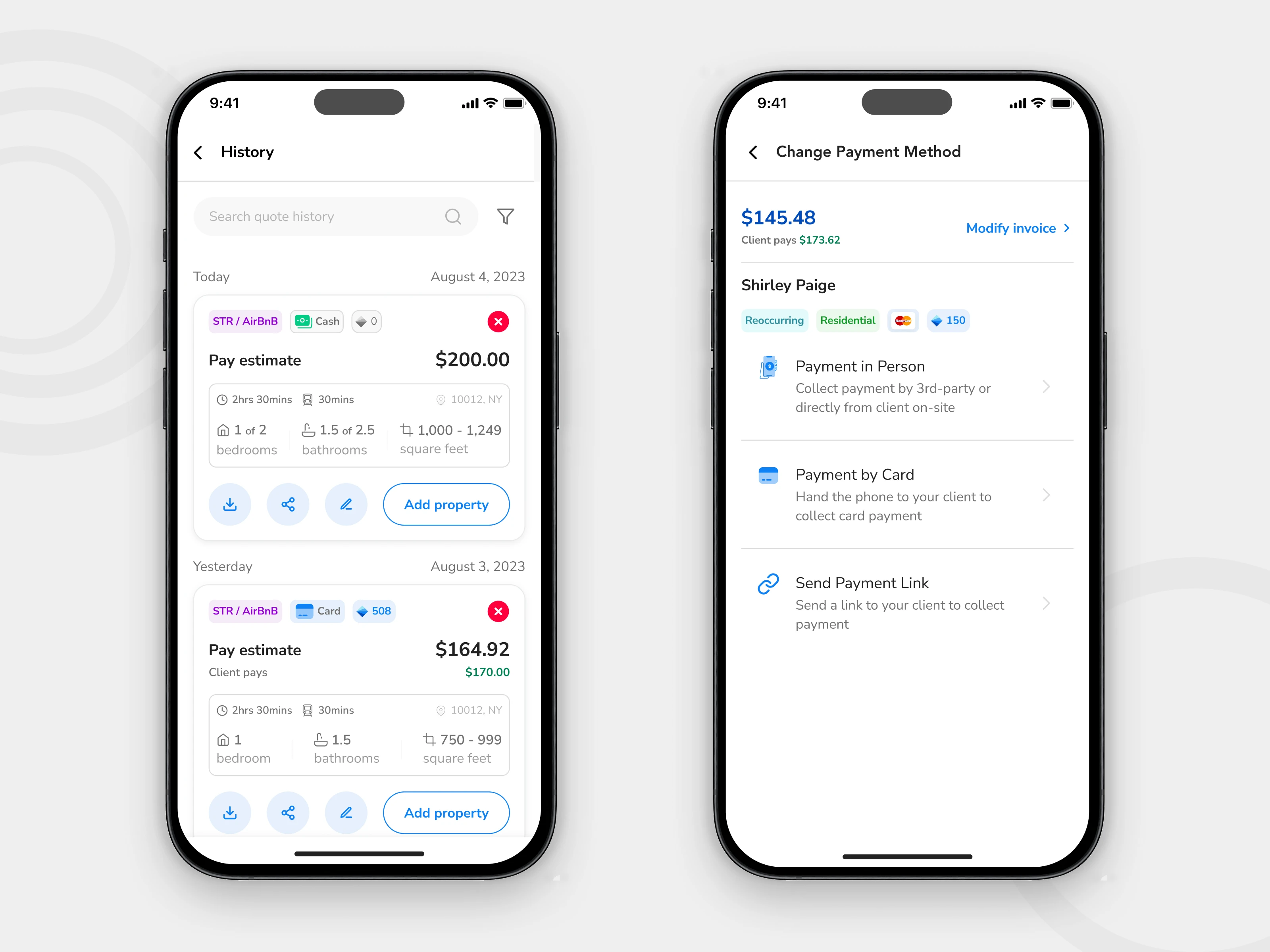
Key decision 3 — Bringing invoicing and payment closer to job completion
In many service businesses, payment friction is not just a finance problem. It is a workflow problem. If the product forces too much separation between completing the work and handling payment, delays become easier to introduce.
The problem
The mobile experience did not yet support payment-related tasks strongly enough in the moment they mattered.
The design move
I expanded the mobile flow to support invoice generation, payment visibility, and payment method actions more directly within the technician experience.
Why this mattered
This reduced the gap between finishing the job and handling the financial follow-up. It also moved the app closer to supporting the full service loop, not just the task execution part of it.

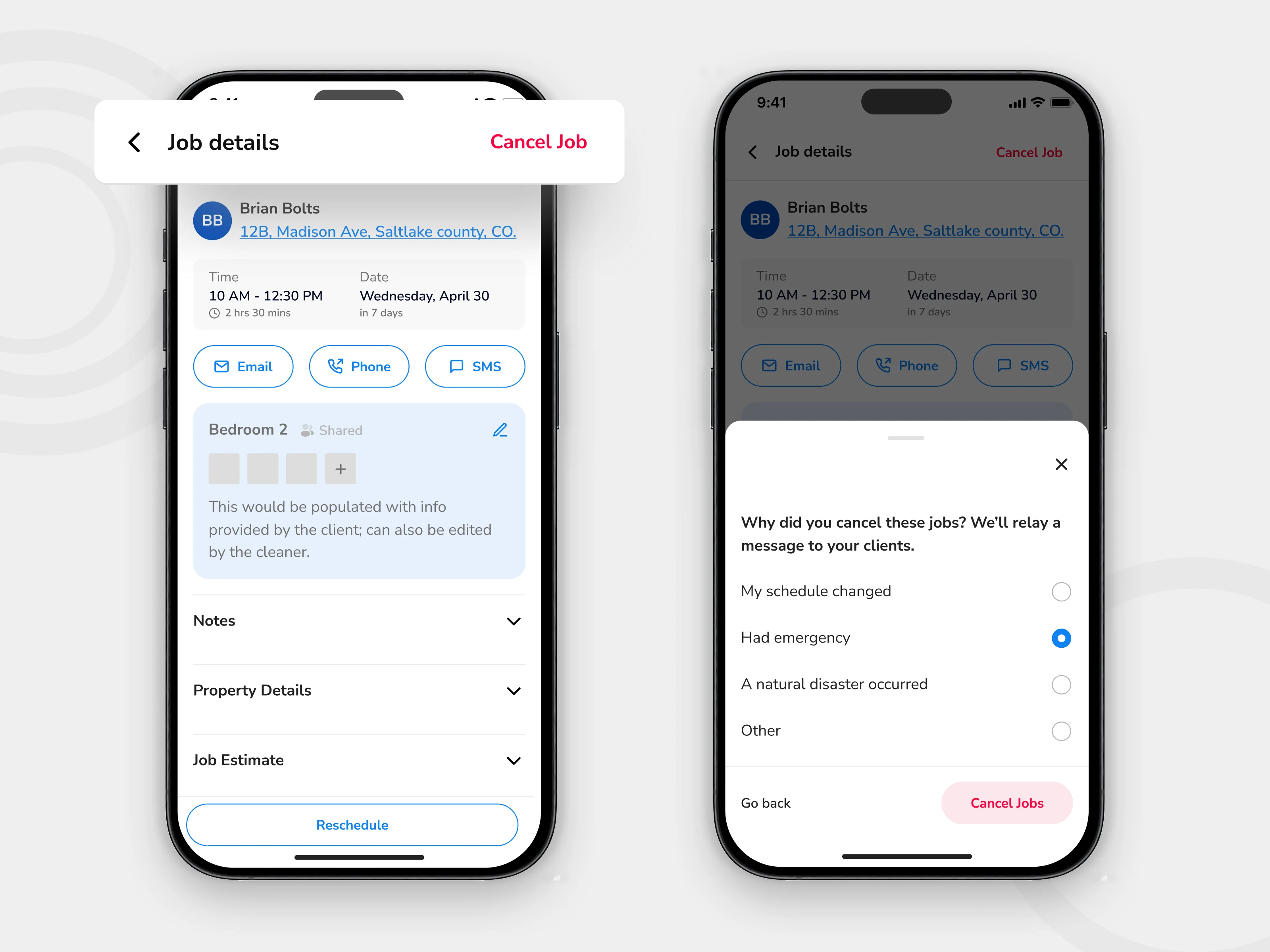
Key decision 4 — Making schedule changes easier to handle on mobile
Scheduling changes are not edge cases in field operations. They are part of the job. A mobile workflow that handles the happy path only is not ready for real use.
Calendar improvements
I designed a more robust calendar interaction model to help users work with scheduled jobs more confidently.
Cancellation flow
I introduced a clearer cancellation experience so users could understand the action, confirm it deliberately, and avoid accidental disruption.
Reschedule flow
I redesigned the reschedule experience to better support updates in context, rather than forcing users through a clumsy workaround.
Why this mattered
These flows made the product more operationally resilient. They helped the app handle the parts of service work that tend to create friction, exceptions, and downstream confusion.
Final solution gallery
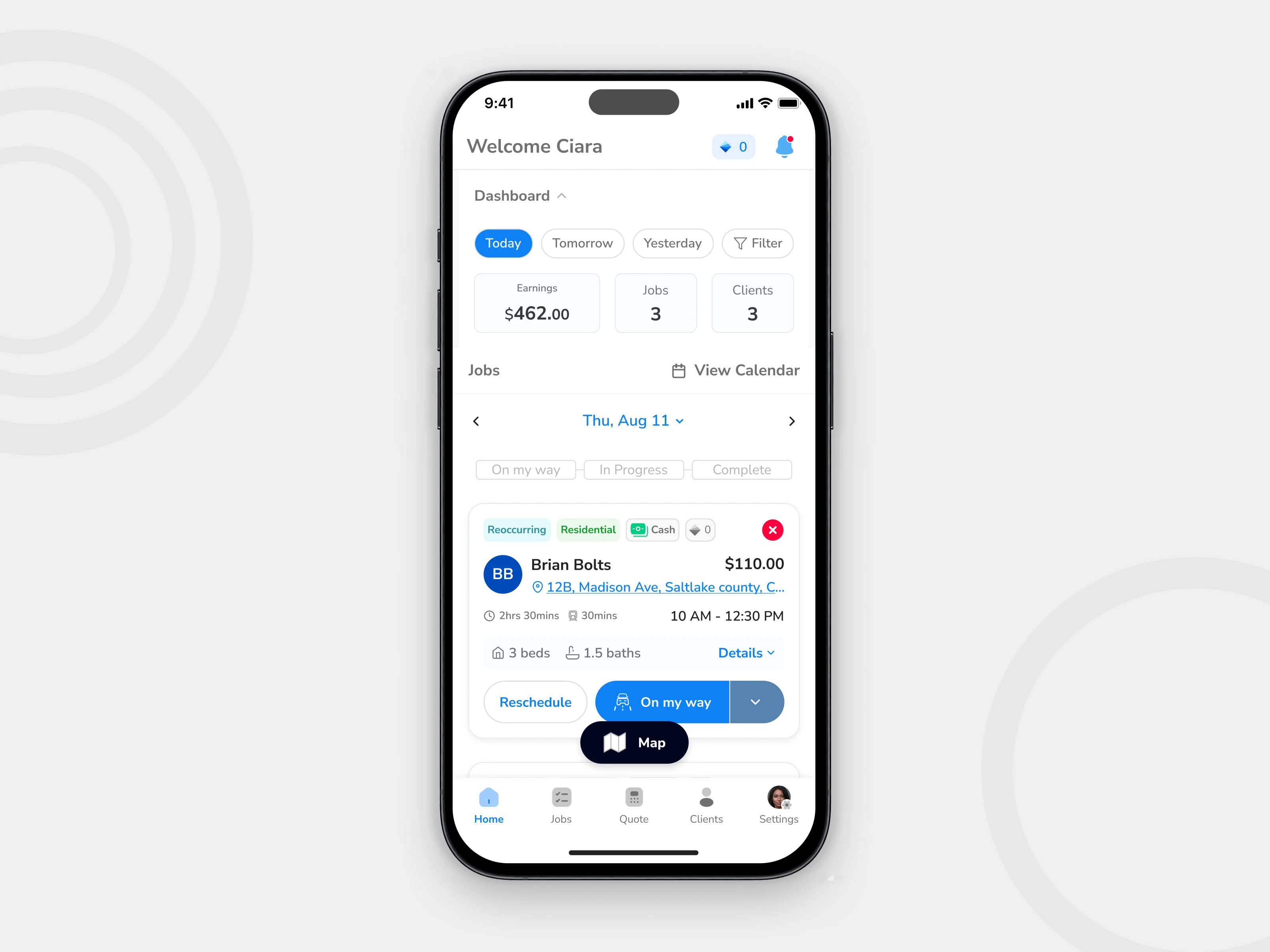
Group A — Home and status progression
The redesigned home experience made the next action easier to understand while keeping key job information visible and scannable.
Group B — Map and route context
Map-based context helped users interpret work geographically, not just chronologically.
Group C — Invoicing and payments
Financial actions were brought closer to the moment of service, reducing the disconnect between job completion and payment handling.
Group D — Scheduling, cancellation, and rescheduling
These workflows made the mobile experience better equipped for real-world operational changes, not just ideal task progression.

Handoff and delivery
The redesign extended across a substantial set of mobile states and supporting screens. I worked within the existing product structure and design system while expanding coverage across several high-impact workflows.
The final handoff included production-ready designs for the updated home workflow, map experience, invoicing and payment flows, and scheduling-related interactions.
200+
Screens handed off across the redesigned workflow set
Outcomes
Stronger workflow clarity
The redesign made core actions easier to understand and easier to complete within the pace of field work.
Broader mobile coverage
Spritz moved closer to supporting the full operational loop on mobile, from job progression to payment and schedule handling.
Better implementation readiness
The work translated product opportunities into a more structured, system-aware set of mobile flows for engineering handoff.
Reflection
Designing for the field changes priorities
What matters most is not how much the interface can show, but how quickly it helps someone decide and act.
Operational products need workflow clarity more than visual flourish
The strongest improvements came from clarifying the sequence of work, not from adding more interface complexity.
Constraints made the work better
Designing within an existing product, system, and technical structure forced sharper decisions and made the final work more realistic.